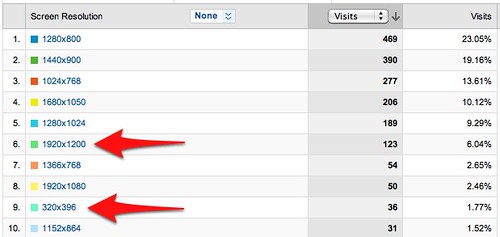
…screens got really small and really big at the same time. Check out these two screen sizes from my blog’s analytics:
In position #6 is a screen the size of an aircraft carrier.
In position #9 is a screen the size of a postage stamp.
One’s a large monitor, probably an LCD like a 24″ iMac. The other’s almost certainly a mobile screen.
This presents a dilemma to content creators. How do you manage to create stuff that looks passable on both?
For the big screens, don’t be afraid to go large with great art. If you have a staff member with a photographic penchant, feature their work (if they permit you to do so, or if their contract permits you to do so) in your creatives. If appropriate, offer freebies in your marketing promotions, like desktop wallpapers, downloadable screen savers and slideshows, and other high resolution, high impact ideas. When I do outreach to college financial aid administrators in the fall, very often I’ll pull photos from my portfolio of New England foliage and just send them as gifts to be used for desktop wallpaper. Costs me nothing, earns me goodwill, and makes use of that Nikon D90 I lug around all the time.
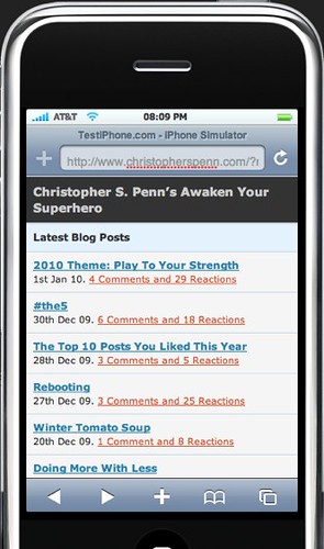
For the really small screens, I recommend two things: first, install WordPress and then install the MobilePress plugin, which is what I run on this blog. It automatically reformats your blog on the fly in a lightweight format that looks good enough but loads instantly.
Second, go install or use mobile phone emulators to see what your properties look like, if you don’t own every phone under the sun. You can download an iPhone emulator from Apple or use TestiPhone.com for the iPhone platform, and Google has Android emulators for the Android platform.
This should help you make the most of the smallest screens coming to visit you.
Small or large, get your content future-ready today. It’ll be here sooner than you think.
Did you enjoy this blog post? If so, please subscribe right now!
Enjoyed it? Please share it!
Get this and other great articles from the source at www.ChristopherSPenn.com


Leave a Reply