What photography can teach you about marketing focus

Warning: this content is older than 365 days. It may be out of date and no longer relevant.

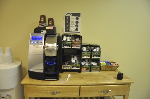
Take a look at this photo of the coffee stand here at the office:

Morning coffee

It’s bland. It’s boring. It tries to cram everything relevant into one picture so that customers don’t miss anything. It’s taken by someone who knows little to nothing about photographic composition, so it’s shot square on with no sense of depth, perspective, or anything. It is, in other words, a typical photo.

That photo is your standard, typical marketing campaign. This is what most marketing is – a long feature list of stuff, much of which may not even be helpful if you don’t already know what the product is. There’s no clear benefit to prospective customers, much of it is confusing, and because it’s so boring and bland to look at, your customers’ mental ad blocking software bounces your campaign out before they even get a chance to investigate.

Here’s the same coffee stand, the same location, with a slightly different look:

Morning coffee

Look how much is missing. All of the extraneous features are gone from the photo. In place of “cram everything into one photo”, we see an intense focus from a radically different perspective. The lens blurs out all the details that aren’t really helpful anyway, and leaves just one or two things in focus. The change in perspective lets you see the coffee stand in a different perspective that you normally would, and makes for a more compelling photo.

This is what your marketing can become. Look at that photo. What’s the central focus – the features of the coffee stand and all the different things you can do at it? No. The central focus is the benefit to the prospective customer – a cup of coffee. The background hints at all your different options, but doesn’t overwhelm you with long lists of stuff.

What could your marketing become if you took away the endless feature lists, if you stripped down your campaigns to focus on just one benefit, if you went at that one benefit from a different perspective than what the committee of marketers usually comes up with? What if you took the risk of focusing only on what was essential – the benefit to the customer – and put away everything else?

It’s not easy, either in photography or in marketing, to take away until only the essence is left. It’s counterintuitive, especially when you have a great product or service that has tons of features and really cool aspects, to want to exclude most of them from the customer’s first look. The rewards, however, make it worthwhile – a much more compelling photo that draws in the eye, and a much more compelling marketing campaign that draws in the customer.

What will your focus be in your next marketing campaign? Whatever it is, I hope you take the risk, take your shot, and show the world just the essence of what you have to offer.


Did you enjoy this blog post? If so, please subscribe right now!

What photography can teach you about marketing focus 1 What photography can teach you about marketing focus 2 What photography can teach you about marketing focus 3

Get this and other great articles from the source at www.ChristopherSPenn.com! Want to take your conference or event to the next level? Book me to speak and get the same quality information on stage as you do on this blog.

Comments

11 responses to “What photography can teach you about marketing focus”

  1. Joe Avatar

    Is that and Edvisors cup??

  2. sam Avatar

    If photography is targeted properly it can prove to be an elixir for the marketing, I like the way you explained things, thanks for sharing the nice post!

  3. Rosh Sillars Avatar

    Chris,

    Very good analogy. Simplicity in everything we do can benefit our business, marketing and lives.

    To add to the thought… Photography is one of the main elements people look at when landing on a Web site. Photography should not be afterthought (as it often is). Ask yourself, does a cheap generic photograph really cut through the noise and represent your company? It's amazing how many business will take a poor snap shot with the closest digital camera to represent their product or service to the world. What kind of impression is that leaving?

    The same can be said for design, writing and strategy. Just because a photograph is in focus, well composed and properly exposed doesn't mean it will get anyone's attention, just like your marketing.

    Rosh

  4. Joe Avatar

    Is that and Edvisors cup??

  5. sam Avatar

    If photography is targeted properly it can prove to be an elixir for the marketing, I like the way you explained things, thanks for sharing the nice post!

  6. Rosh Avatar

    Chris,

    Very good analogy. Simplicity in everything we do can benefit our business, marketing and lives.

    To add to the thought… Photography is one of the main elements people look at when landing on a Web site. Photography should not be afterthought (as it often is). Ask yourself, does a cheap generic photograph really cut through the noise and represent your company? It’s amazing how many business will take a poor snap shot with the closest digital camera to represent their product or service to the world. What kind of impression is that leaving?

    The same can be said for design, writing and strategy. Just because a photograph is in focus, well composed and properly exposed doesn’t mean it will get anyone’s attention, just like your marketing.

    Rosh

  7. larrylawfer Avatar

    This is funny to me, having been a professional commercial photographer for many years. You are a great social media marketeer and a darn good photographer. Your point about clutter in the message is accurate and important. I think what I would have like to have seen in the “better” illustration is something that would make me want to take action and then how to take that action. In your second picture you know it is about coffee, but what kind? The low angle on the coffee cup is more about the cup than the coffee. I know, I know this is just an illustration about a point you are making about clutter in your message. I got that, the rest is just kinda funny to me. Have a great weekend

  8. larrylawfer Avatar

    This is funny to me, having been a professional commercial photographer for many years. You are a great social media marketeer and a darn good photographer. Your point about clutter in the message is accurate and important. I think what I would have like to have seen in the “better” illustration is something that would make me want to take action and then how to take that action. In your second picture you know it is about coffee, but what kind? The low angle on the coffee cup is more about the cup than the coffee. I know, I know this is just an illustration about a point you are making about clutter in your message. I got that, the rest is just kinda funny to me. Have a great weekend

  9. larrylawfer Avatar

    This is funny to me, having been a professional commercial photographer for many years. You are a great social media marketeer and a darn good photographer. Your point about clutter in the message is accurate and important. I think what I would have like to have seen in the “better” illustration is something that would make me want to take action and then how to take that action. In your second picture you know it is about coffee, but what kind? The low angle on the coffee cup is more about the cup than the coffee. I know, I know this is just an illustration about a point you are making about clutter in your message. I got that, the rest is just kinda funny to me. Have a great weekend

Leave a Reply

Your email address will not be published. Required fields are marked *

Pin It on Pinterest

Shares
Share This